Vodafone Idea

Transforming and uplifting the telecom industry in India

  • Design System
  • Tokens
  • User Interface

PROJECT OVERVIEW

We led the end-to-end design of their digital ecosystem — spanning mobile apps, websites, marketing communications, and more. Our focus was on translating complex telecom journeys into intuitive and human-centered experiences that truly connect with India’s diverse user base. From streamlining recharge flows and account management to crafting scalable design systems and personalized emailers, our work helped shape how over 20 million Indians engage with Vi every day.

CHALLENGE

Navigating a volatile telecom market, the challenge was to reimagine the digital identity of two merging global brands. With customer retention at stake, the goal was to deliver a unified, user-first experience across all touchpoints. A key focus was the mobile app — designed to simplify migration from legacy apps and serve over 20 million users with consistency and ease.

DISCOVER

To approach design in telecommunications, our team of UX Researchers conducted workshops with the clients to understand users’ pain points, expectations and motivations in order to arrive at the usability score of the individual apps.

We also conducted a thorough research on the user reviews on the market place. Most of the apps had outdated design language and the experience also needed to be relooked.

DEFINE

We started with identifying personas and creating user journeys. We defined intuitive workflows such as recharge, bills and balance checks for the users and pitched for various first of kind initiatives directed boost customer acquisition and engagement.

DELIVER

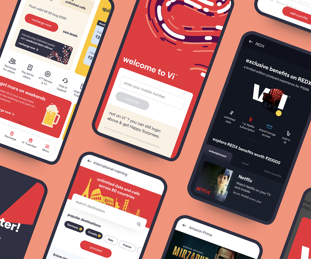
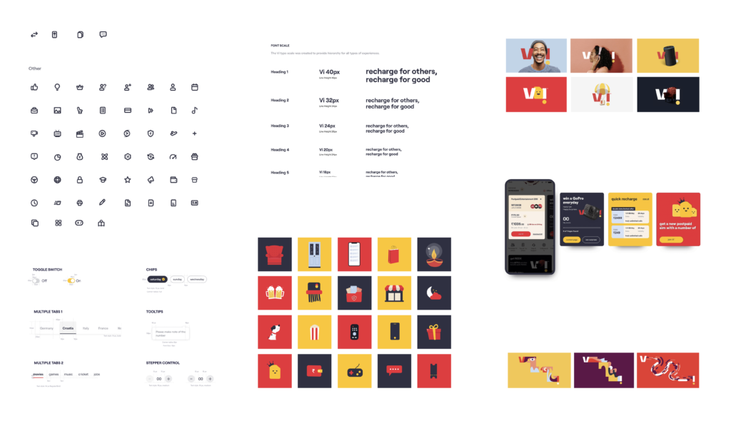
In the UI, we gave a completely new and fresh look to the app by updating the design system to match the new brand guidelines. We brought the boldness of Vodafone and the playfulness of Idea.

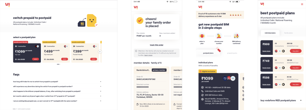
Every screen prompts us to take an action, thus leading to another screen and hence higher engagement. Elements including the icons and the artwork are in sync throughout and a right balance of colors red and yellow highlights the brand integration of both brands.

IMPACT

We crafted a seamless user experience that unified the best of both legacy apps without disrupting usage patterns. The result was a product that scaled effortlessly and resonated with millions.

• 300M+ customers served

• 60M+ app downloads

• 1.5M+ bill payments

• 3.5M+ recharges

• 75M+ total visitors

• 4.0 star average app rating